グラフ作成ができるWordPressプラグインのなかでも、かなり自由度の高いamChartsを使ったグラフサンプルです。
1から作るのがめんどくさい!という人や、そもそもamChartsの使い方がまったくわからね!という方は、ここにあるサンプルを是非有効活用してみてください。基本的にコピペだけで使えるようにしました。
目次
サンプル使用方法
グラフサンプルの使い方です。
どこに何をコピペしていけばいいのか?という基本的な手順を解説しています。
新規グラフの作成
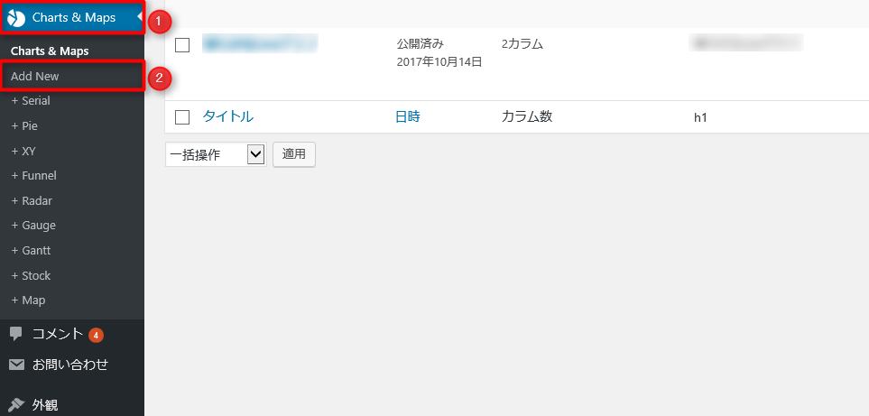
プラグイン『amCharts: Charts and Maps』をインストール&有効化後、『Charts and Maps』→『Add new』の順にクリック。
グラフタイトルの入力
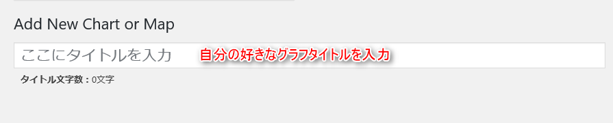
Add new Charts and Mapsのページで、自分の好きなグラフタイトルを入力する。
Resorces、HTML、JavaScriptをそれぞれコピペ

あとは、Resources、HTML、JavaScriptをそれぞれコピペするだけです。
超簡単ですね。
それではいってみましょー
グラフサンプル一覧
棒グラフ

もっとも基本的なグラフです。amChartsのデフォルト設定のままですが、利用価値は高いので掲載しておきました。
何らかのデータを比較したり、期間の変化量を表すときにはあれこれ考えずとりあえず棒グラフを使っておけば分かりやすいですね。
・Resorces
//www.amcharts.com/lib/3/amcharts.js
//www.amcharts.com/lib/3/serial.js
・HTML
<div id="chartdiv" style="width: 100%; height: 300px;"></div>
・JavaScript
var $CHART$ = AmCharts.makeChart( "chartdiv", {
  "type": "serial",
  "dataProvider": [ {
    "country": "USA",
    "visits": 2025
  }, {
    "country": "China",
    "visits": 1882
  }, {
    "country": "Japan",
    "visits": 1809
  }, {
    "country": "Germany",
    "visits": 1322
  }, {
    "country": "UK",
    "visits": 1122
  }, {
    "country": "France",
    "visits": 1114
  }, {
    "country": "India",
    "visits": 984
  }, {
    "country": "Spain",
    "visits": 711
  }, {
    "country": "Netherlands",
    "visits": 665
  }, {
    "country": "Russia",
    "visits": 580
  }, {
    "country": "South Korea",
    "visits": 443
  }, {
    "country": "Canada",
    "visits": 441
  }, {
    "country": "Brazil",
    "visits": 395
  } ],
  "valueAxes": [ {
    "gridColor": "#FFFFFF",
    "gridAlpha": 0.2,
    "dashLength": 0
  } ],
  "gridAboveGraphs": true,
  "startDuration": 1,
  "graphs": [ {
    "balloonText": "[[category]]: <b>[[value]]</b>",
    "fillAlphas": 0.8,
    "lineAlpha": 0.2,
    "type": "column",
    "valueField": "visits"
  } ],
  "chartCursor": {
    "categoryBalloonEnabled": false,
    "cursorAlpha": 0,
    "zoomable": false
  },
  "categoryField": "country",
  "categoryAxis": {
    "gridPosition": "start",
    "gridAlpha": 0
  }
} );
3D棒グラフ
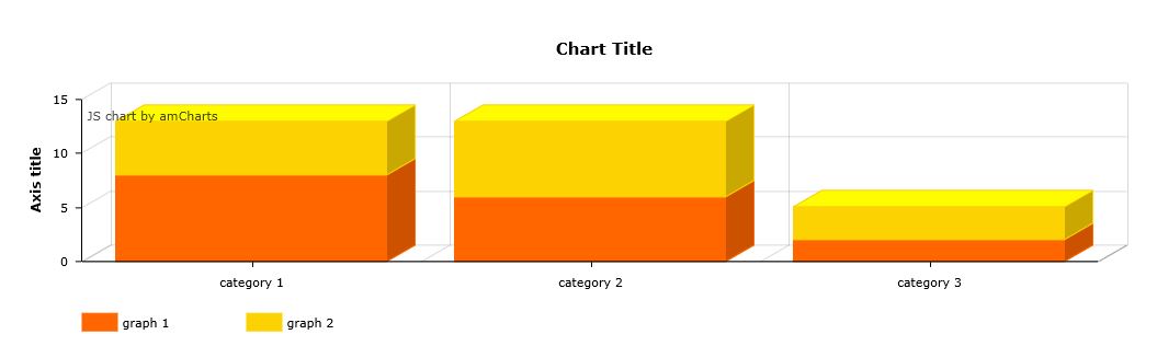
棒グラフを3D化したものです。ただし、ひとつ前に紹介した棒グラフとは違い、積み上げ式の棒グラフです。このようなグラフは、期間ごとの割合の変化を視覚的に把握できるという点で優れています。
例えば、ASPを複数使っている場合には、ASPごとの報酬額を積み上げて期間ごとに並べることで、全体とASPごとの割合の変化が分かります。
・Resorces
//www.amcharts.com/lib/3/amcharts.js
//www.amcharts.com/lib/3/serial.js
・HTML
<div id="chartdiv" style="width: 100%; height: 300px;"></div>
・JavaScript
AmCharts.makeChart("chartdiv",
				{
					"type": "serial",
					"categoryField": "category",
					"angle": 30,
					"depth3D": 30,
					"startDuration": 1,
					"categoryAxis": {
						"gridPosition": "start"
					},
					"trendLines": [],
					"graphs": [
						{
							"balloonText": "[[title]] of [[category]]:[[value]]",
							"fillAlphas": 1,
							"id": "AmGraph-1",
							"title": "graph 1",
							"type": "column",
							"valueField": "column-1"
						},
						{
							"balloonText": "[[title]] of [[category]]:[[value]]",
							"fillAlphas": 1,
							"id": "AmGraph-2",
							"title": "graph 2",
							"type": "column",
							"valueField": "column-2"
						}
					],
					"guides": [],
					"valueAxes": [
						{
							"id": "ValueAxis-1",
							"stackType": "regular",
							"title": "Axis title"
						}
					],
					"allLabels": [],
					"balloon": {},
					"legend": {
						"enabled": true,
						"useGraphSettings": true
					},
					"titles": [
						{
							"id": "Title-1",
							"size": 15,
							"text": "Chart Title"
						}
					],
					"dataProvider": [
						{
							"category": "category 1",
							"column-1": 8,
							"column-2": 5
						},
						{
							"category": "category 2",
							"column-1": 6,
							"column-2": 7
						},
						{
							"category": "category 3",
							"column-1": 2,
							"column-2": 3
						}
					]
				}
			);
滑らかなLineグラフ
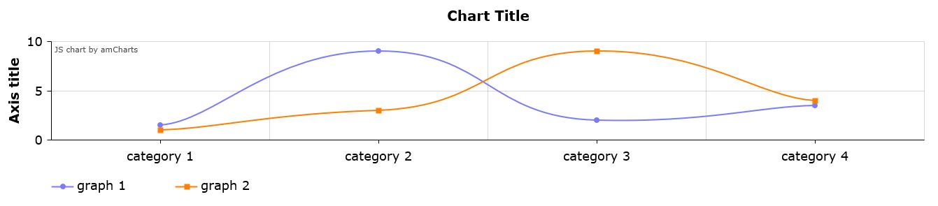
折れ線グラフを作成するときにプロットしたデータを滑らかに結んだグラフです。その名の通り、実際に滑らかな変化をする事象を表すときに使えるグラフです。
例えば、ホルモン分泌量や血圧変化などです。
・Resorces
//www.amcharts.com/lib/3/amcharts.js
//www.amcharts.com/lib/3/serial.js
・HTML
<div id="chartdiv" style="width: 100%; height: 300px;"></div>
・JavaScript
AmCharts.makeChart("chartdiv",
				{
					"type": "serial",
					"categoryField": "category",
					"startDuration": 1,
					"fontSize": 18,
					"theme": "light",
					"categoryAxis": {
						"gridPosition": "start",
						"title": ""
					},
					"trendLines": [],
					"graphs": [
						{
							"balloonText": "[[title]] of [[category]]:[[value]]",
							"bullet": "round",
							"id": "AmGraph-1",
                          "lineColor": "#7b7bff",
                          "lineThickness": 2,
							"title": "graph 1",
							"type": "smoothedLine",
							"valueField": "graph 1"
						},
						{
							"balloonText": "[[title]] of [[category]]:[[value]]",
							"bullet": "square",
							"id": "AmGraph-2",
                          "lineColor": "#ff8000",
                          "lineThickness": 2,
							"title": "graph 2",
							"type": "smoothedLine",
							"valueField": "graph 2"
						}
					],
					"guides": [],
					"valueAxes": [
						{
							"id": "ValueAxis-1",
							"title": "Axis title"
						}
					],
					"allLabels": [],
					"balloon": {},
					"legend": {
						"enabled": true,
						"useGraphSettings": true
					},
					"titles": [
						{
							"id": "Title-1",
							"size": 20,
							"text": "Chart Title"
						}
					],
					"dataProvider": [
						{
							"category": "category 1",
							"graph 1": "1.5",
							"graph 2": "1"
						},
						{
							"category": "category 2",
							"graph 1": "9",
							"graph 2": "3"
						},
						{
							"category": "category 3",
							"graph 1": "2",
							"graph 2": "9"
						},
						{
							"category": "category 4",
							"graph 1": "3.5",
							"graph 2": "4"
						}
					]
				}
			);
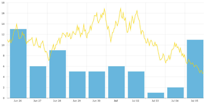
棒グラフと折れ線グラフの共存
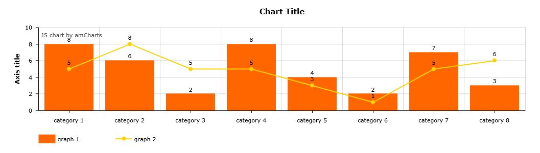
棒グラフと折れ線グラフを同時に表示させたグラフです。基本的に、棒グラフのデータと、折れ線グラフのデータが比較する意味のあるものである必要があります。
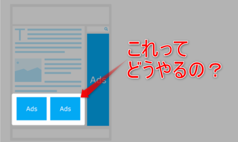
例えば、住宅数(棒グラフ)と日経平均(折れ線グラフ)や、アドセンス報酬(棒グラフ)とアクセス数(折れ線グラフ)などです。
・Resorces
//www.amcharts.com/lib/3/amcharts.js
//www.amcharts.com/lib/3/serial.js
・HTML
<div id="chartdiv" style="width: 100%; height: 300px;"></div>
・JavaScript
AmCharts.makeChart("chartdiv",
				{
					"type": "serial",
					"categoryField": "category",
					"startDuration": 1,
					"categoryAxis": {
						"gridPosition": "start"
					},
					"trendLines": [],
					"graphs": [
						{
							"balloonText": "[[title]] of [[category]]:[[value]]",
							"fillAlphas": 1,
							"id": "AmGraph-1",
							"labelText": "[[value]]",
							"title": "graph 1",
							"type": "column",
							"valueField": "column-1"
						},
						{
							"balloonText": "[[title]] of [[category]]:[[value]]",
							"bullet": "round",
							"id": "AmGraph-2",
							"labelText": "[[value]]",
							"lineThickness": 2,
							"title": "graph 2",
							"valueField": "column-2"
						}
					],
					"guides": [],
					"valueAxes": [
						{
							"id": "ValueAxis-1",
							"title": "Axis title"
						}
					],
					"allLabels": [],
					"balloon": {},
					"legend": {
						"enabled": true,
						"useGraphSettings": true
					},
					"titles": [
						{
							"id": "Title-1",
							"size": 15,
							"text": "Chart Title"
						}
					],
					"dataProvider": [
						{
							"category": "category 1",
							"column-1": 8,
							"column-2": 5
						},
						{
							"category": "category 2",
							"column-1": 6,
							"column-2": 8
						},
						{
							"category": "category 3",
							"column-1": 2,
							"column-2": 5
						},
                      {
							"category": "category 4",
							"column-1": 8,
							"column-2": 5
						},
                      {
							"category": "category 5",
							"column-1": 4,
							"column-2": 3
						},
                      {
							"category": "category 6",
							"column-1": 2,
							"column-2": 1
						},
                      {
							"category": "category 7",
							"column-1": 7,
							"column-2": 5
						},
                      {
							"category": "category 8",
							"column-1": 3,
							"column-2": 6
						}
					]
				}
			);
横棒グラフ(棒グラフのX軸Y軸入れ替え)
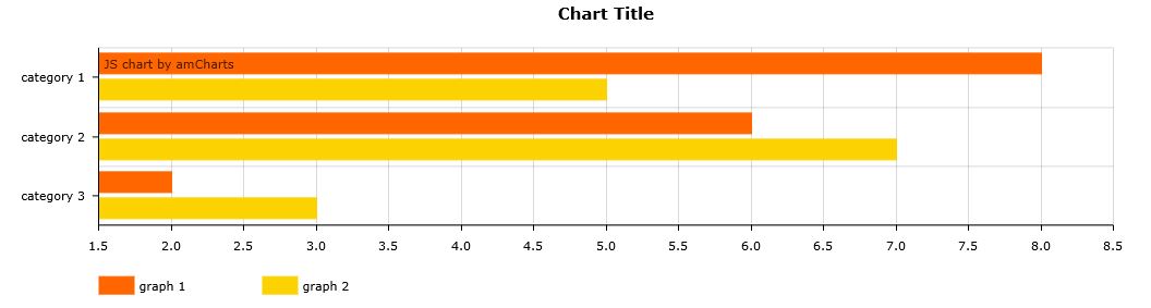
棒グラフを横にしただけのグラフです。時系列による変化を負う必要がないデータを視覚化するときによく使われるグラフです。
・Resorces
//www.amcharts.com/lib/3/amcharts.js
//www.amcharts.com/lib/3/serial.js
・HTML
<div id="chartdiv" style="width: 100%; height: 300px;"></div>
・JavaScript
AmCharts.makeChart("chartdiv",
				{
					"type": "serial",
					"categoryField": "category",
					"rotate": true,
					"startDuration": 1,
					"categoryAxis": {
						"gridPosition": "start"
					},
					"trendLines": [],
					"graphs": [
						{
							"balloonText": "[[title]] of [[category]]:[[value]]",
							"fillAlphas": 1,
							"id": "AmGraph-1",
							"title": "graph 1",
							"type": "column",
							"valueField": "column-1"
						},
						{
							"balloonText": "[[title]] of [[category]]:[[value]]",
							"fillAlphas": 1,
							"id": "AmGraph-2",
							"title": "graph 2",
							"type": "column",
							"valueField": "column-2"
						}
					],
					"guides": [],
					"valueAxes": [
						{
							"id": "ValueAxis-1",
							"title": ""
						}
					],
					"allLabels": [],
					"balloon": {},
					"legend": {
						"enabled": true,
						"useGraphSettings": true
					},
					"titles": [
						{
							"id": "Title-1",
							"size": 15,
							"text": "Chart Title"
						}
					],
					"dataProvider": [
						{
							"category": "category 1",
							"column-1": 8,
							"column-2": 5
						},
						{
							"category": "category 2",
							"column-1": 6,
							"column-2": 7
						},
						{
							"category": "category 3",
							"column-1": 2,
							"column-2": 3
						}
					]
				}
			);
折れ線グラフ
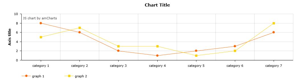
棒グラフと並び、一番使い勝手のいいグラフです。棒グラフで表示するか、折れ線グラフで表示するか、好みで選んでもいいでしょう。
・Resorces
//www.amcharts.com/lib/3/amcharts.js
//www.amcharts.com/lib/3/serial.js
・HTML
<div id="chartdiv" style="width: 100%; height: 300px;"></div>
・JavaScript
AmCharts.makeChart("chartdiv",
				{
					"type": "serial",
					"categoryField": "category",
					"startDuration": 1,
					"categoryAxis": {
						"gridPosition": "start"
					},
					"trendLines": [],
					"graphs": [
						{
							"balloonText": "[[title]] of [[category]]:[[value]]",
							"bullet": "round",
							"id": "AmGraph-1",
							"title": "graph 1",
							"valueField": "column-1"
						},
						{
							"balloonText": "[[title]] of [[category]]:[[value]]",
							"bullet": "square",
							"id": "AmGraph-2",
							"title": "graph 2",
							"valueField": "column-2"
						}
					],
					"guides": [],
					"valueAxes": [
						{
							"id": "ValueAxis-1",
							"title": "Axis title"
						}
					],
					"allLabels": [],
					"balloon": {},
					"legend": {
						"enabled": true,
						"useGraphSettings": true
					},
					"titles": [
						{
							"id": "Title-1",
							"size": 15,
							"text": "Chart Title"
						}
					],
					"dataProvider": [
						{
							"category": "category 1",
							"column-1": 8,
							"column-2": 5
						},
						{
							"category": "category 2",
							"column-1": 6,
							"column-2": 7
						},
						{
							"category": "category 3",
							"column-1": 2,
							"column-2": 3
						},
						{
							"category": "category 4",
							"column-1": 1,
							"column-2": 3
						},
						{
							"category": "category 5",
							"column-1": 2,
							"column-2": 1
						},
						{
							"category": "category 6",
							"column-1": 3,
							"column-2": 2
						},
						{
							"category": "category 7",
							"column-1": 6,
							"column-2": 8
						}
					]
				}
			);
面グラフ
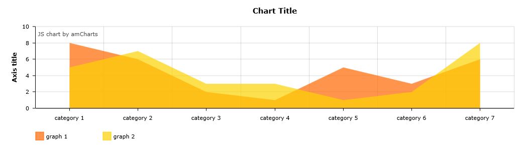
棒グラフで結んだ直線とX軸で囲まれた範囲が塗りつぶされたグラフです。
比較したい2種類のデータがある場合には、折れ線グラフを2つ重ねて表示させるよりも、面グラフで重ねて表示させた方が2つの差が分かりやすかったりします。
・Resorces
//www.amcharts.com/lib/3/amcharts.js
//www.amcharts.com/lib/3/serial.js
・HTML
<div id="chartdiv" style="width: 100%; height: 300px;"></div>
・JavaScript
AmCharts.makeChart("chartdiv",
				{
					"type": "serial",
					"categoryField": "category",
					"startDuration": 1,
					"categoryAxis": {
						"gridPosition": "start"
					},
					"trendLines": [],
					"graphs": [
						{
							"balloonText": "[[title]] of [[category]]:[[value]]",
							"fillAlphas": 0.7,
							"id": "AmGraph-1",
							"lineAlpha": 0,
							"title": "graph 1",
							"valueField": "column-1"
						},
						{
							"balloonText": "[[title]] of [[category]]:[[value]]",
							"fillAlphas": 0.7,
							"id": "AmGraph-2",
							"lineAlpha": 0,
							"title": "graph 2",
							"valueField": "column-2"
						}
					],
					"guides": [],
					"valueAxes": [
						{
							"id": "ValueAxis-1",
							"title": "Axis title"
						}
					],
					"allLabels": [],
					"balloon": {},
					"legend": {
						"enabled": true
					},
					"titles": [
						{
							"id": "Title-1",
							"size": 15,
							"text": "Chart Title"
						}
					],
					"dataProvider": [
						{
							"category": "category 1",
							"column-1": 8,
							"column-2": 5
						},
						{
							"category": "category 2",
							"column-1": 6,
							"column-2": 7
						},
						{
							"category": "category 3",
							"column-1": 2,
							"column-2": 3
						},
						{
							"category": "category 4",
							"column-1": "1",
							"column-2": 3
						},
						{
							"category": "category 5",
							"column-1": "5",
							"column-2": 1
						},
						{
							"category": "category 6",
							"column-1": 3,
							"column-2": 2
						},
						{
							"category": "category 7",
							"column-1": 6,
							"column-2": 8
						}
					]
				}
			);
3D円グラフ
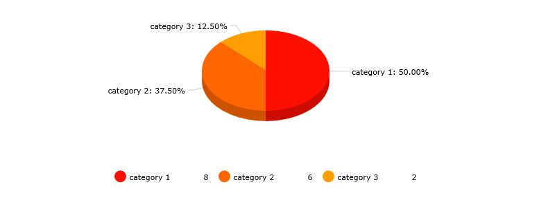
円グラフの3D版です。円グラフ自体はamChartsにデフォルトで存在しています。
1日のスケジュールや割合を表す時に使われるグラフですね。
・Resorces
//www.amcharts.com/lib/3/amcharts.js
//www.amcharts.com/lib/3/pie.js
・HTML
<div id="chartdiv" style="width: 100%; height: 300px;"></div>
・JavaScript
AmCharts.makeChart("chartdiv",
				{
					"type": "pie",
					"angle": 33.3,
					"balloonText": "[[title]]<br><span style='font-size:14px'><b>[[value]]</b> ([[percents]]%)</span>",
					"depth3D": 15,
					"innerRadius": 0,
					"titleField": "category",
					"valueField": "column-1",
					"theme": "default",
					"allLabels": [],
					"balloon": {},
					"legend": {
						"enabled": true,
						"align": "center",
						"markerType": "circle"
					},
					"titles": [],
					"dataProvider": [
						{
							"category": "category 1",
							"column-1": 8
						},
						{
							"category": "category 2",
							"column-1": 6
						},
						{
							"category": "category 3",
							"column-1": 2
						}
					]
				}
			);
散布図と回帰直線
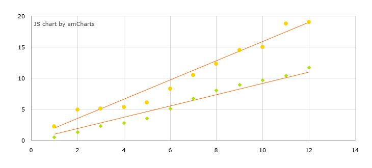
統計学でよく用いられている散布図と、将来値の予測に役立つ回帰直線のグラフです。
アフィリエイトをやっていく上ではあんまり登場する機会はないかもしれませんが、健康系(サプリメントやダイエット食品)などのアフィリエイトを行う時に、モニターの結果を散布図で表示して、回帰直線によってどれくらいの効果があるのか?を分かりやすく表示するって方法も考えられますね。
・Resorces
//www.amcharts.com/lib/3/amcharts.js
//www.amcharts.com/lib/3/xy.js
・HTML
<div id="chartdiv" style="width: 100%; height: 300px;"></div>
・JavaScript
AmCharts.makeChart("chartdiv",
				{
					"type": "xy",
					"startDuration": 1.5,
					"trendLines": [
						{
							"finalValue": 11,
							"finalXValue": 12,
							"id": "TrendLine-1",
							"initialValue": 1,
							"initialXValue": 1,
							"lineColor": "#FF6600"
						},
						{
							"finalValue": 19,
							"finalXValue": 12,
							"id": "TrendLine-2",
							"initialValue": 2,
							"initialXValue": 1,
							"lineColor": "#FF6600"
						}
					],
					"graphs": [
						{
							"balloonText": "x:<b>[[x]]</b> y:<b>[[y]]</b>",
							"bullet": "diamond",
							"id": "AmGraph-1",
							"lineAlpha": 0,
							"lineColor": "#b0de09",
							"xField": "ax",
							"yField": "ay"
						},
						{
							"balloonText": "x:<b>[[x]]</b> y:<b>[[y]]</b>",
							"bullet": "round",
							"id": "AmGraph-2",
							"lineAlpha": 0,
							"lineColor": "#fcd202",
							"xField": "bx",
							"yField": "by"
						}
					],
					"guides": [],
					"valueAxes": [
						{
							"id": "ValueAxis-1",
							"axisAlpha": 0
						},
						{
							"id": "ValueAxis-2",
							"position": "bottom",
							"axisAlpha": 0
						}
					],
					"allLabels": [],
					"balloon": {},
					"titles": [],
					"dataProvider": [
						{
							"ax": 1,
							"ay": 0.5,
							"bx": 1,
							"by": 2.2
						},
						{
							"ax": 2,
							"ay": 1.3,
							"bx": 2,
							"by": 4.9
						},
						{
							"ax": 3,
							"ay": 2.3,
							"bx": 3,
							"by": 5.1
						},
						{
							"ax": 4,
							"ay": 2.8,
							"bx": 4,
							"by": 5.3
						},
						{
							"ax": 5,
							"ay": 3.5,
							"bx": 5,
							"by": 6.1
						},
						{
							"ax": 6,
							"ay": 5.1,
							"bx": 6,
							"by": 8.3
						},
						{
							"ax": 7,
							"ay": 6.7,
							"bx": 7,
							"by": 10.5
						},
						{
							"ax": 8,
							"ay": 8,
							"bx": 8,
							"by": 12.3
						},
						{
							"ax": 9,
							"ay": 8.9,
							"bx": 9,
							"by": 14.5
						},
						{
							"ax": 10,
							"ay": 9.7,
							"bx": 10,
							"by": 15
						},
						{
							"ax": 11,
							"ay": 10.4,
							"bx": 11,
							"by": 18.8
						},
						{
							"ax": 12,
							"ay": 11.7,
							"bx": 12,
							"by": 19
						}
					]
				}
			);
縮尺変更可能な折れ線グラフ

上のつまみを動かすことでグラフの縮尺を変更することができる折れ線グラフです。
Google Analyticsとかではアクセス解析画面の縮尺が変更可能なので、模擬的なAnalytics画面を作り出すことも可能かもしれません。他サイトと差別化できそうですね。
・Resorces
//www.amcharts.com/lib/3/amcharts.js
//www.amcharts.com/lib/3/serial.js
・HTML
<div id="chartdiv" style="width: 100%; height: 300px;"></div>
・JavaScript
AmCharts.makeChart("chartdiv",
				{
					"type": "serial",
					"categoryField": "date",
					"dataDateFormat": "YYYY",
					"theme": "default",
					"categoryAxis": {
						"minPeriod": "YYYY",
						"parseDates": true
					},
					"chartCursor": {
						"enabled": true,
						"animationDuration": 0,
						"categoryBalloonDateFormat": "YYYY"
					},
					"chartScrollbar": {
						"enabled": true
					},
					"trendLines": [],
					"graphs": [
						{
							"bullet": "round",
							"id": "AmGraph-1",
							"title": "graph 1",
							"valueField": "column-1"
						},
						{
							"bullet": "square",
							"id": "AmGraph-2",
							"title": "graph 2",
							"valueField": "column-2"
						}
					],
					"guides": [],
					"valueAxes": [
						{
							"id": "ValueAxis-1",
							"title": "Axis title"
						}
					],
					"allLabels": [],
					"balloon": {},
					"legend": {
						"enabled": true,
						"useGraphSettings": true
					},
					"titles": [
						{
							"id": "Title-1",
							"size": 15,
							"text": "Chart Title"
						}
					],
					"dataProvider": [
						{
							"date": "2001",
							"column-1": 8,
							"column-2": 5
						},
						{
							"date": "2002",
							"column-1": 6,
							"column-2": 7
						},
						{
							"date": "2003",
							"column-1": 2,
							"column-2": 3
						},
						{
							"date": "2004",
							"column-1": 4,
							"column-2": 3
						},
						{
							"date": "2005",
							"column-1": 2,
							"column-2": 1
						},
						{
							"date": "2006",
							"column-1": 3,
							"column-2": 2
						},
						{
							"date": "2007",
							"column-1": 2,
							"column-2": 5
						},
						{
							"date": "2008",
							"column-1": 5,
							"column-2": 3
						},
						{
							"date": "2009",
							"column-1": 4,
							"column-2": 1
						},
						{
							"date": "2010",
							"column-1": 1,
							"column-2": 7
						},
						{
							"date": "2011",
							"column-1": 6,
							"column-2": 3
						},
						{
							"date": "2012",
							"column-1": 3,
							"column-2": 7
						},
						{
							"date": "2013",
							"column-1": 4,
							"column-2": 5
						},
						{
							"date": "2014",
							"column-1": 8,
							"column-2": 6
						},
						{
							"date": "2015",
							"column-1": 2,
							"column-2": 7
						},
						{
							"date": "2016",
							"column-1": 3,
							"column-2": 4
						},
						{
							"date": "2017",
							"column-1": 2,
							"column-2": 9
						}
					]
				}
			);
2つの値をセットにした棒グラフ
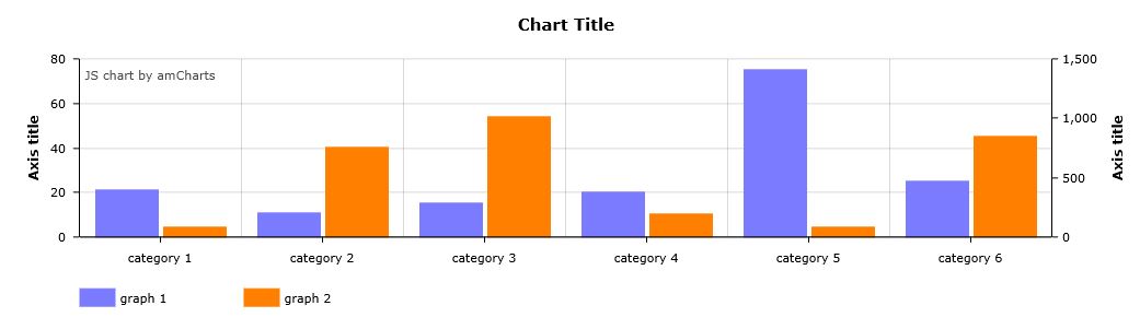
2つの値をセットにした棒グラフです。時系列で変化する2つの値の変化をとらえる時に便利なグラフです。
3つの値や4つの値を比較していきたいときには、”balloonText”で始まる行から”valueField”で始まる行までの要素を比較したい数だけ追加していけばOKです。
・Resorces
//www.amcharts.com/lib/3/amcharts.js
//www.amcharts.com/lib/3/serial.js
・HTML
<div id="chartdiv" style="width: 100%; height: 300px;"></div>
・JavaScript
AmCharts.makeChart("chartdiv",
				{
					"type": "serial",
					"categoryField": "category",
					"startDuration": 1,
					"categoryAxis": {
						"gridPosition": "start"
					},
					"trendLines": [],
					"graphs": [
						{
							"balloonText": "[[title]] of [[category]]:[[value]]",
							"fillAlphas": 1,
							"id": "AmGraph-1",
							"title": "graph 1",
                          "lineColor": "#7b7bff",
							"type": "column",
							"valueField": "column-1"
						},
						{
							"balloonText": "[[title]] of [[category]]:[[value]]",
							"fillAlphas": 1,
							"id": "AmGraph-2",
							"title": "graph 2",
                          "lineColor": "#ff8000",
							"type": "column",
							"valueAxis": "ValueAxis-2",
							"valueField": "column-2"
						}
					],
					"guides": [],
					"valueAxes": [
						{
							"id": "ValueAxis-1",
							"title": "Axis title"
						},
						{
							"id": "ValueAxis-2",
							"position": "right",
							"gridAlpha": 0,
							"title": "Axis title"
						}
					],
					"allLabels": [],
					"balloon": {},
					"legend": {
						"enabled": true,
						"useGraphSettings": true
					},
					"titles": [
						{
							"id": "Title-1",
							"size": 15,
							"text": "Chart Title"
						}
					],
					"dataProvider": [
						{
							"category": "category 1",
							"column-1": "21",
							"column-2": "80"
						},
						{
							"category": "category 2",
							"column-1": "11",
							"column-2": "756"
						},
						{
							"category": "category 3",
							"column-1": "15",
							"column-2": "1008"
						},
						{
							"category": "category 4",
							"column-1": "20",
							"column-2": "190"
						},
						{
							"category": "category 5",
							"column-1": "75",
							"column-2": "80"
						},
						{
							"category": "category 6",
							"column-1": "25",
							"column-2": "850"
						}
					]
				}
			);
 ⇒
⇒